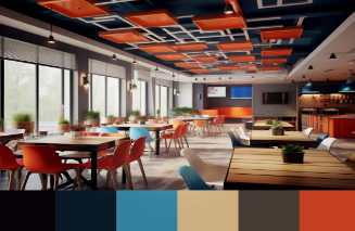
In the competitive world of hospitality, the ambiance of a restaurant plays a crucial role in attracting and retaining customers. One of the most effective ways to create an inviting atmosphere is through the strategic use of color in restaurant interior design. Color psychology, the study of how colors influence human behavior and emotions, can be a powerful tool in shaping the dining experience. In this blog, we will explore how to leverage color psychology in your restaurant interior design to influence customer mood, enhance their dining experience, and ultimately drive more business.
Understanding Color Psychology
Color psychology is based on the idea that colors can evoke specific emotions and reactions. For instance, warm colors like red and orange can stimulate appetite and energy, while cool colors like blue and green are often associated with calmness and relaxation. By understanding these associations, restaurant owners can make informed decisions about their interior design choices, creating an environment that aligns with their brand and enhances the customer experience.
Warm Colors: Inviting Appetite and Energy
- Red: Often associated with excitement and passion, red is known to stimulate appetite and increase heart rates. This makes it an excellent choice for restaurants looking to create a vibrant and energetic atmosphere. Red can be incorporated through accent walls, artwork, or furnishings. For example, a red feature wall can create a focal point in the dining area, drawing attention and invigorating the space.
- Orange: Like red, orange is a warm color that promotes feelings of enthusiasm and cheerfulness. It is often associated with sociability, making it a great choice for casual dining settings. Consider using orange in your restaurant interior design through décor elements like cushions, artwork, or table settings to create a friendly and welcoming environment.
- Yellow: Known for its uplifting qualities, yellow can evoke feelings of happiness and warmth. However, it’s important to use yellow sparingly, as too much can be overwhelming. Pairing yellow with neutral tones can create a balanced look that enhances the overall atmosphere. A touch of yellow in the form of tableware or wall art can brighten up the space and create a cheerful vibe.
Cool Colors: Promoting Calmness and Relaxation
- Blue: Often associated with tranquility and calmness, blue can help create a serene dining environment. This color is perfect for restaurants aiming to provide a relaxing experience, such as fine dining establishments or health-focused eateries. Consider using various shades of blue in your restaurant interior design, from deep navy to soft pastel hues. A blue accent wall or blue-toned furnishings can evoke a sense of peace and comfort.
- Green: Symbolizing nature and freshness, green is another color that promotes relaxation. It can create a sense of balance and harmony in the dining space. Restaurants focused on health and sustainability can incorporate green through plant life, green walls, or earthy color palettes. This not only enhances the aesthetic appeal but also resonates with the values of health-conscious diners.
- Purple: While it may not be as commonly used, purple can evoke feelings of luxury and sophistication. It is often associated with creativity and imagination. Incorporating purple accents, such as decorative items or lighting, can elevate the dining experience in upscale restaurants, providing an air of elegance and uniqueness.
Neutral Colors: Creating Balance and Flexibility
- White: White is often associated with cleanliness and simplicity. It can create a spacious and open feel, making it an excellent choice for smaller restaurants. White walls can serve as a blank canvas, allowing other colors and décor elements to stand out. Pairing white with bold accent colors can create a dynamic yet balanced atmosphere.
- Gray: This versatile color can evoke feelings of sophistication and modernity. Gray can be used as a neutral backdrop that complements other colors, allowing for flexibility in your restaurant interior design. Incorporating various shades of gray in your furniture or fixtures can create an elegant and contemporary space.
- Beige and Brown: Earthy tones like beige and brown create a warm and inviting atmosphere. These colors are often associated with comfort and stability, making them ideal for casual dining environments. Use wooden elements, such as furniture and flooring, to enhance the natural feel of your restaurant.
Creating a Cohesive Color Scheme
When designing your restaurant interior, it’s important to create a cohesive color scheme that reflects your brand identity and enhances the overall dining experience. Here are some tips to achieve this:
- Consider Your Brand: Your restaurant’s concept and theme should guide your color choices. For example, a rustic café may benefit from earthy tones, while a modern fusion restaurant might lean towards bold and vibrant colors.
- Use Accent Colors: While it’s important to have a primary color scheme, incorporating accent colors can add visual interest. Consider using contrasting colors in artwork, decor, or furnishings to create focal points and enhance the overall aesthetic.
- Test Colors in Different Lighting: Colors can appear differently under various lighting conditions. It’s essential to test paint samples or fabric swatches in the actual space before making final decisions. This ensures that the chosen colors align with your vision and create the desired atmosphere.
- Consider Seasonal Changes: As seasons change, consider updating your color scheme to keep the environment fresh and inviting. Subtle shifts in decor, such as changing cushions or table settings, can help maintain customer interest throughout the year.
- Read more: Quality Juvederm at Discount Costs
Impact on Customer Experience
The right color choices in your restaurant interior design can significantly influence customer behavior and emotions. Here’s how:
- Length of Stay: Warm colors like red and orange can encourage customers to stay longer, as they create an inviting and energetic atmosphere. In contrast, cool colors like blue may promote relaxation, making customers feel comfortable lingering over their meals.
- Perceived Value: Colors can influence how customers perceive the quality of food and service. Luxurious colors like deep purple or gold can enhance the perceived value of fine dining experiences, making customers willing to pay more for their meals.
- Social Interaction: Color can also impact social behavior. Warm, vibrant colors can encourage conversation and social interaction, making them ideal for casual dining environments. In contrast, calming colors may be better suited for intimate dining experiences.
Conclusion
Using color psychology in restaurant interior design is a powerful strategy for influencing customer mood and enhancing their dining experience. By thoughtfully selecting and combining colors, restaurant owners can create inviting environments that resonate with their target audience. Whether you aim to stimulate appetite, promote relaxation, or enhance perceived value, understanding the emotional impact of colors is essential. Embrace the art of color psychology, and watch your restaurant thrive in the competitive UAE dining scene.


